#141: Enhance Similarity Maps (Embeddings) Visualization in cBioPortal
Labels: cBioPortal, Java, Javascript, Size: Medium (175h), Size: Large (350h), Difficulty: Medium, GSoC-2026
Project Description
cBioPortal recently added a new "Similarity Maps" feature to the Study View (PR #5224) that visualizes UMAP/PCA embeddings of cancer samples. This allows researchers to explore relationships between samples based on genomic, histological, or combined features. The initial implementation is a prototype with several areas for improvement.
This project aims to enhance the Similarity Maps feature to make it production-ready and more powerful for cancer research.
<img width="1243" height="729" alt="Image" src="https://github.com/user-attachments/assets/22b32521-945a-438e-99e2-b2835cf4cfe4" />Goals
Core Improvements (Medium Project ~175 hours)
-
Backend Data Architecture
- Move embedding data from S3 files to proper datahub storage
- Design database schema for embeddings
- Create ingestion pipeline for embedding data
-
Enhanced Tooltips
- Show user-selectable fields in tooltips
- Similar to the approach in cbioportal-zarr-loader
-
Improved Coloring Options
- When coloring by a specific gene, add ability to color by mutation type
- Add custom color thresholding similar to IGV
-
Additional Visual Dimensions
- Add ability to use an attribute as another dimension (e.g., shape)
- Allow combining color and shape for multi-dimensional exploration
Extended Goals (Large Project ~350 hours)
-
AI Integration
- For selected points, enable AI-powered queries about the data
- Similar to Cell Whisperer
- "What patterns exist in these selected samples?"
- "What distinguishes these samples from the rest?"
-
Dynamic UMAP Generation
- Backend support for subsetting data and generating UMAP on the fly
Skills Required
- Frontend: TypeScript, React, deck.gl
- Backend: Java, Spring Boot, SQL
- Nice to have: Python (for embedding generation), experience with dimensionality reduction (UMAP, PCA)
Mentors
- @inodb
References
- PR #5224 - Add Embeddings to Study View
- cbioportal-zarr-loader
- Cell Whisperer
- IGV Color Thresholding
Difficulty
Medium to Hard (depending on scope chosen)
Project Size
- Medium (~175 hours): Core improvements (goals 1-4)
- Large (~350 hours): Core + Extended goals (goals 1-6)
#140: Optimizing Co-Expression Performance with ClickHouse
Labels: enhancement, Java, SQL, Size: Medium (175h), Difficulty: Medium, GSoC-2026
Background
The Co-Expression analysis feature in cBioPortal is a computationally intensive tool that allows researchers to identify genes whose expression patterns correlate across a study. However, the current implementation is facing significant performance bottlenecks: the endpoint is slow to return results and consumes a high amount of server memory.
<img width="577" height="400" alt="Image" src="https://github.com/user-attachments/assets/dad55f44-f342-4643-8aee-9e8d63dcce03" />Goal
The goal of this project is to drastically reduce the latency and memory footprint of the Co-Expression endpoint by migrating the calculation logic to a high-performance analytical database (ClickHouse) and optimizing the backend retrieval strategy.
- Performance Target: Reduce API response time for large-scale co-expression queries by at least 70%.
- Memory Optimization: Shift the heavy lifting of correlation calculations from the Java heap to the database layer.
- Scalability: Ensure the solution works across various molecular profiles (RNA-seq, Microarray, etc.) and handles large-scale cohorts like TCGA.
Approach
- Bottleneck Analysis: Profile the existing Java-based co-expression service to identify the specific methods causing memory pressure.
- ClickHouse Implementation: Implement high-speed correlation functions using ClickHouse solution (e.g., Pearson or Spearman correlation) directly within the database.
- Multi-Profile Support: Generalize the ClickHouse schema and query logic to support different molecular data types and study configurations.
- API Refactoring: Update the cBioPortal backend to delegate calculation tasks to ClickHouse, ensuring proper handling of different molecular profiles and study filters.
- Validation: Benchmarking the new implementation against the legacy system to ensure mathematical accuracy and performance gains.
Need skills
- Java: Proficiency in Spring Boot and backend development.
- ClickHouse / SQL: Strong knowledge of analytical database design and optimized query writing.
- Data Engineering: Experience with large-scale data processing and performance tuning.
- Mathematics/Statistics: Basic understanding of correlation algorithms.
Possible mentors
- @alisman (Aaron Lisman)
#138: AI-Assisted Curation Dashboard for cBioPortal
Labels: Javascript, Python, Size: Large (350h), Difficulty: Medium, LLM, GSoC-2026
Background:
The cBioPortal Data Contribution Dashboard is under active development to provide tools for managing and tracking paper curation workflows. However, much of the curation process still relies heavily on manual interpretation of file format specifications and Standard Operating Procedures (SOPs). New curators face a steep learning curve, often requiring weeks to months to become proficient, while experienced curators frequently need to refer to prior studies and edge-case handling procedures during curation.
In parallel, an AI-powered Curation Assistant tool has been prototyped to support documentation-driven guidance and answer questions specific to curation resources. However, both tools are currently in development stages and not yet fully functional or integrated.
The Challenge:
- The dashboard needs further development to support complete curation workflows
- The AI assistant needs enhancement to provide comprehensive curation guidance
- Neither tool is connected, requiring the development of both systems plus their integration
The Opportunity: By developing both tools in tandem and integrating them from the ground up, we can create a unified, AI-powered curation platform that actively assists users throughout the entire curation process, improving efficiency, reducing curation time and ensuring consistency across curated datasets.
Project Goal:
This project will simultaneously develop and integrate two complementary systems:
- Enhance the cBioPortal Data Contribution Dashboard to support end-to-end curation workflows
- Enhance the AI Curation Assistant to provide comprehensive curation guidance
- Integrate both systems to create a unified AI-assisted curation platform
The result will be a production-ready system where curators can perform all curation tasks while receiving real-time AI assistance within a single, cohesive interface.
Work Distribution:
This project requires balanced effort across three areas:
| Component | Estimated Effort | Complexity |
|---|---|---|
| Dashboard Development | ~40% (140 hours) | Frontend UI/UX, backend APIs, file handling |
| AI Assistant Development | ~35% (120 hours) | RAG pipeline, LLM integration, knowledge base |
| Integration & Testing | ~25% (90 hours) | System integration, testing, documentation |
Technology Stack:
- Frontend: React.js (existing dashboard codebase), Material-UI for chat widget
- Backend: Node.js/Express (existing), extend with chat API endpoints
- AI Layer: Python with existing Curation Assistant codebase, LangChain, LLM integration
- Database: LevelDB or PostgreSQL for storage, ChromaDB for vector embeddings
- Authentication: Integrate with the existing OAuth system
#137: Reimagining the Study View Charts Menu: A UX-Driven Redesign
Labels: Javascript, Size: Medium (175h), Difficulty: Medium, GSoC-2026
Reimagining the Study View Charts Menu: A UX-Driven Redesign
Background:
The cBioPortal for Cancer Genomics Study View page is one of the most frequently used features of the platform, allowing researchers to explore and visualize clinical and genomic data across cancer studies. A critical component of this page is the Charts menu, which enables users to select which data attributes to display as interactive visualizations.
<div align="center"> <img src="https://github.com/user-attachments/assets/33865013-7e32-4374-a374-e753b91bdb18" width="650"> </div>The current Charts menu presents users with a tabbed interface (Clinical, Genomic, Gene Specific, Custom Data, X vs Y) containing flat lists of available attributes with checkboxes and frequency indicators. While functional, this design presents several UX challenges:
- Information overload: With 50+ attributes available, users face a long scrolling list with limited visual hierarchy
- Lack of discoverability: Users cannot easily identify which attributes might be most relevant to their research questions
- Limited context: The frequency percentage alone doesn't convey the richness or distribution of the underlying data
- Accessibility concerns: The current design may not optimally serve users with varying levels of cBioPortal expertise
As cBioPortal continues to grow with more data types and attributes, improving the usability of this core interface becomes increasingly important for both new and experienced users.
Goal:
Redesign the Study View Charts menu to create a more intuitive, informative, and efficient user experience. This project encourages creative solutions—the student will research UX best practices, gather user feedback, and propose innovative approaches to help researchers quickly find and visualize the data they need.
Approach:
This is an open-ended, design-driven project. The student should explore multiple directions and propose their own solutions. Potential areas to investigate include:
Research & Discovery Phase:
- Analyze usage patterns: which charts are most commonly added? In what combinations?
- Study UX patterns from other data visualization tools (Tableau, Observable, etc.)
- Review accessibility guidelines (WCAG) for complex selection interfaces
Implementation:
- Create interactive prototypes (Figma, Adobe XD, or similar)
- Implement the chosen design in React/TypeScript
- Add comprehensive unit and integration tests
- Document design decisions and rationale
Deliverables:
- UX research findings
- Design mockups/prototypes showing proposed solutions
- Working implementation in the cBioPortal frontend
Needed skills:
- JavaScript/TypeScript
- React
- CSS/SCSS
- UX design fundamentals
Nice to have:
- Experience with design tools (Figma, Sketch, Adobe XD)
- Data visualization experience
- Accessibility (a11y) knowledge
Possible mentors:
@ali
[truncated]
#136: Automated Clinical Metadata Harmonization Dashboard
Labels: Javascript, Python, Size: Medium (175h), Size: Large (350h), Difficulty: Medium, GSoC-2026
Background
cBioPortal hosts over 400 cancer genomics studies with clinical metadata from diverse sources. While individual studies are well-curated, metadata heterogeneity across studies severely limits cross-study analysis and machine learning applications. For example:
- Treatment information appears as 24+ different terms: RADIO_THERAPY, Rad, XRT, Radiation, etc.
- Age attributes vary: AGE, AGE_AT_DIAGNOSIS, DIAGNOSIS_AGE, age_at_initial_pathologic_diagnosis
- Disease staging uses inconsistent systems: TUMOR_STAGE_2009, AJCC_STAGE, STAGE, PATHOLOGIC_STAGE
We manually harmonized metadata from 375 cBioPortal studies, creating a standardized data dictionary with:
- Unified attribute names (e.g., all age attributes → age_at_diagnosis)
- Ontology integration (NCIT, MONDO, UBERON terms)
- Controlled vocabularies for categorical variables
- Cross-study comparability enabling large-scale ML applications
cBioPortal continuously adds new studies, and manual harmonization cannot scale to keep up. We need an automated harmonization system to maintain consistency as the repository grows. We have been working on an automated harmonization pipeline using the manually harmonized metadata as a reference. The pipeline is featured with:
- Schema mapper: Sentence transformer-based attribute name matching (BioBERT/PubMedBERT)
- Value harmonizer: Semantic search with ontology validation (NCIT/MONDO)
- Confidence scoring: Threshold-based classification for mapping quality
Goal
The primary deliverable is the MetaHarmonizer Dashboard, an interactive, production-ready web application for the cBioPortal curator workflow with full documentation. The dashboard will be featured with
- Automatically harmonizes new cBioPortal study metadata using machine learning
- Visualizes harmonization results with confidence scores and suggestions
- Enables curator review and editing of automated mappings
- Tracks harmonization history and maintains data quality metrics
- Exports harmonized metadata in standardized formats
The core deliverables will include,
- Dashboard application with source code and deployment instructions
- REST API for harmonization pipeline access
- Benchmarking report on existing mappers with improvements implemented
- Integration guide for cBioPortal data loading pipeline
Documentation includes,
- User guide for curators (with screenshots and tutorials)
- API documentation
- Deployment and maintenance guide
- Performance evaluation report
Approach
Phase 1: Evaluation & Benchmarking (Weeks 1-2)
Test existing mappers on recent cBioPortal studies. Benchmark performance:
- Mapping accuracy (precision, recall, F1)
- Confidence score calibration
- Edge case handling (missing values, free-text, synonyms)
- Processing speed and scalability
Identify gaps and implement improvements to the harmonization pipeline as needed.
Phase 2: Interactive Dashboard Development (Weeks 3-12)
Build production-ready web application integrated into cBioPortal'
[truncated]
#135: Enhance 3D Protein Structure Viewer in cBioPortal using AlphaFold Data
Labels: Java, Javascript, Size: Large (350h), Difficulty: Hard, GSoC-2026
Background
cBioPortal currently integrates a 3D protein structure viewer that maps cancer mutations onto protein models using sequence alignments against experimentally-determined structures (e.g., PDB) via the G2S service. However, this viewer is not fully functional today, and coverage is limited to proteins with available PDB entries. ([G2S])
Meanwhile, the AlphaFold Protein Structure Database provides predicted 3D structures for nearly all human proteins with high accuracy, dramatically increasing structural coverage far beyond experimentally solved structures. ([AlphaFold])
Integrating AlphaFold data into the cBioPortal 3D viewer would significantly improve mutation visualization and interpretation by enabling structure views for proteins currently missing PDB coverage.
Goal
Enable a fully functional and enriched 3D protein structure viewer in cBioPortal that:
- Retrieves and displays AlphaFold predicted models for human proteins (in addition to PDB structures).
- Maps cancer mutations, allele annotations, and variant features onto these structures.
- Update the current UI for users to explore both PDB and AlphaFold structures in the portal.
- (Optional) Ensures performance, caching, and appropriate model confidence display, including pLDDT/PAE metrics from AlphaFold.
Approach
1. Backend Enhancements in G2S
- Add support for fetching or caching AlphaFold model files (e.g., mmCIF/PDB or API retrieval) for human proteins.
- Store necessary metadata (UniProt accessions → AlphaFold models) in the portal database or external cache.
- Extend or refactor existing alignment tables to reference both PDB and AlphaFold models.
- Implement REST API endpoints to serve model coordinates and corresponding mutation mappings to the frontend.
2. Structure Alignment & Mapping Pipeline in G2S
-
Build/update an automated pipeline that:
- Queries the AlphaFold database for available predictions for a given gene/protein.
- Ensures reliable mappings between gene identifiers, protein sequences, and structure models.
- Precomputes residue alignment ranges (sequence ↔ structure coordinates).
-
Handle multiple isoforms and alternative transcripts where applicable.
3. Frontend (React / TypeScript) in cBioPortal
- Fix and update the current protein viewer (e.g., using NGLViewer, Mol*), supporting:
- Loading both experimental (PDB) and predicted (AlphaFold) structures.
- Color-coding regions by mutation density or confidence metrics (e.g., pLDDT per residue).
- Displaying mutation “pins”, labels, and interactive exploration tools.
- Handle error states gracefully (e.g., missing model, low confidence regions).
4. UX & Visualization Considerations
- Display AlphaFold confidence metrics (e.g., pLDDT, PAE) visually (e.g., color gradients).
- Add legends/info panels that explain structure sourc
[truncated]
#134: cBioPortal User Profile Page
Labels: Javascript, Size: Medium (175h), Difficulty: Medium, GSoC-2026
Background
cBioPortal users can create and save various data artifacts during their analysis sessions, including virtual cohorts, custom groups, saved filters, and session bookmarks. Currently, these items are scattered across different parts of the application with no unified view. Users have no central place to manage their saved data, review their analysis history, or configure personal preferences.
As cBioPortal continues to evolve with new features — including AI-powered chat interfaces and experimental visualizations — there is also a growing need for users to opt-in to beta features before they are generally available.
Goal
Build a User Profile Page that serves as a centralized hub for users to:
- View and manage saved data: Virtual cohorts, custom groups, saved filters, session bookmarks, and any other user-generated artifacts
- Configure preferences: Default study selections, display settings, notification preferences
- Opt-in to experimental features: Allow users to enable beta features (e.g., AI chat, new visualizations) before general release
- Review account information: For authenticated users, display account details and data usage
Approach
1. Backend (Java / Spring Boot)
- Re-use existing endpoints as much as possible to pull in all relevant user data
2. Frontend (React / TypeScript)
- Build a new
UserProfilePagecomponent with tabbed navigation:- My Data: List and manage virtual cohorts, groups, saved sessions
- Preferences: UI settings, defaults, notifications
- Experimental Features: Toggle switches for beta features with descriptions
- Account: User info, data usage, export/delete options
- Add profile access via user menu in the main navigation
3. Feature Flag System
- We currently use localStorage to indicate feature flags, we can show activated ones in the user profile
- Provide clear descriptions and disclaimers for experimental features
Need skills
- TypeScript & React: Required for building the profile UI
Resources
Possible mentors
@jfkonecn
#132: MCP Apps: Interactive Genomic Visualizations for AI Clients
Labels: Javascript, Size: Large (350h), Difficulty: Hard, LLM, GSoC-2026
Background
The Model Context Protocol (MCP) enables AI assistants to connect with external data sources and tools. cBioPortal has early-stage MCP infrastructure allowing AI agents to query cancer genomics data.
The newly released MCP Apps specification extends this by allowing tools to return interactive UI components that render directly within AI conversations. Instead of plain text responses, MCP servers can now serve dashboards, visualizations, forms, and multi-step workflows that users interact with inline.
This opens an exciting opportunity: cBioPortal's rich genomic visualizations (OncoPrint, mutation plots, survival curves, etc.) could be delivered as interactive MCP Apps within ChatGPT, Claude, and other AI clients.
Goal
Build MCP Apps that expose cBioPortal's key visualizations as interactive components within AI conversations:
- OncoPrint App: Query mutations/CNAs for a gene set → render interactive OncoPrint with tooltips, sorting, filtering
- Survival Analysis App: Select cohort + stratification → interactive Kaplan-Meier curves
- Mutation Mapper App: Query a gene → interactive lollipop plot with domain annotations
- Study Summary App: Quick cohort overview with clickable drill-downs
Users could ask an AI: "Show me TP53 mutations across TCGA breast cancer" and receive an interactive visualization directly in the chat.
Approach
1. MCP Server Extension (TypeScript/Node.js)
- Extend cBioPortal's existing MCP server with UI-returning tools
- Implement
_meta.ui.resourceUrimetadata pointing to bundled UI resources - Serve UI resources via the
ui://scheme per MCP Apps spec
2. Visualization Components (React/TypeScript)
- Adapt existing cBioPortal-frontend components for standalone use
- Bundle as self-contained HTML/JS packages for iframe rendering
- Implement bidirectional JSON-RPC communication via
postMessage - Handle cohort filtering, click events, and state updates
3. Integration & Testing
- Test with Claude Desktop, ChatGPT, and VS Code (all support MCP Apps)
- Ensure responsive design for various client viewport sizes
- Document setup for users wanting to connect their AI client to cBioPortal
Need skills
- TypeScript & React: Required for adapting visualization components
- MCP Protocol: Familiarity with MCP servers and the Apps extension
- Data Visualization: Experience with interactive charts
- cBioPortal API: Understanding of cBioPortal's REST API and data models
Resources
Possible mentors
@zainas
[truncated]
#131: Frequency & Counts Tables for Generic Assay Data
Labels: Java, Javascript, Size: Medium (175h), Difficulty: Medium, GSoC-2026
Background
cBioPortal uses the Generic Assay Format to store diverse data types that do not fit into standard molecular categories (e.g., microbiome data, mutational signatures, or arm-level copy number alterations). While these data types are accessible, they currently lack high-level cohort summaries in the Summary tab of Study View. Researchers need a way to see "at-a-glance" statistics—specifically counts and frequencies—for these events across an entire study or a filtered subset of samples.
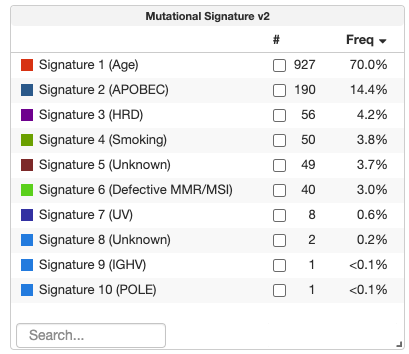
Goal
The objective of this project is to implement responsive, interactive Frequency/Counts Tables for studies containing Generic Assay Binary or Categorical data.
- For Categorical Data: Show a summary of event types (e.g., 1p gain vs. 1p loss) across the cohort.
- For Binary Data: Show a summary of "true/yes" events per entity.
- Interactive Filtering: The table must serve as both a visualization and a tool; clicking a row should filter the global cohort, and changes to the global cohort should trigger a re-calculation of the table's frequencies.
Approach
This project requires a full-stack implementation to ensure high performance with large datasets and seamless interactivity.
1. Backend (Java / Spring Boot)
- API Development: Create a new REST API endpoint (e.g.,
/api/generic-assays/fetch) to handle statistical aggregation. - Dynamic Calculation: Implement logic to calculate sample counts and percentage frequencies for each entity and category.
- Server-Side Filtering: To ensure accuracy, the backend must accept a list of
sampleIdsor filter criteria to return real-time re-calculated frequencies based on the user's active cohort selection.
2. Frontend (React / TypeScript)
- New Component: Build a
GenericAssayFrequencyTablecomponent within the cBioPortal frontend repo.- Categorical Layout:
Entity (e.g., 1p) | Category (e.g., gain) | # samples | % samples - Binary Layout:
Entity | # samples | % samples w/ positive value
- Categorical Layout:
- State Management (MobX): Integrate the component with the
StudyViewStoreso it automatically re-fetches data when global filters change. - Visual Integration: Add the tables to the "Summary" tab of the Study View and ensure they are discoverable via the "Add Charts" menu.
Need skills
- Java (Spring Boot): Required for developing and optimizing the backend aggregation service.
- TypeScript & React: Required for building the table UI and managing frontend state.
- Data Structures: Experience transforming API responses into aggregated frequency maps.
Possible mentors
- @dippindots (Gaofei Zhao)
#126: cBioPortal Study View: Advanced Dashboard Integration
Labels: Java, Javascript, Size: Medium (175h), GSoC-2026
Background
The current cBioPortal Study View primarily displays clinical and genomic data. We want to develop new features that extend this view by integrating:
- Spatial-oriented Dashboards: For studies with imaging data, these dashboards will highlight spatial features such as tumor-infiltrating lymphocytes (TILs) and spatial marker densities.
- Curated Study Dashboards: For specific studies, these dashboards will automatically display key research findings (e.g., gene expression differences), reproducing insights from research publications.
A sample study that can be used for development and testing is the crc_orion_2024 study.
Goal
Enhance the current cBioPortal Study View, which primarily displays clinical and genomic data, by incorporating new dashboard features that add both spatial visualizations and curated study-specific plots. This enhancement is designed to:
- Enrich the user experience by adding spatial data insights to the existing clinical and genomic data.
- Automatically configure dashboards based on study metadata, ensuring that key findings and spatial features are prominently displayed.
Approach
-
Design and Layout:
- Create a default spatial-oriented dashboard layout that emphasizes critical spatial data (e.g., TILs and cell density).
- Develop a configuration system to detect studies that require curated dashboards and predefine the visualizations to be displayed.
-
Backend & Frontend Integration:
- Enhance backend services to process study metadata and automatically select the appropriate dashboard configuration.
- Update frontend components to dynamically render both spatial visualizations and curated study-specific plots, ensuring a seamless integration with the current clinical and genomic views.
- Address challenges such as summarizing data from multiple samples, similar to the approach used in the structural variants table within Chromoscope.
-
Testing and Validation:
- Conduct thorough testing across various study types to ensure that the new dashboards accurately display the intended data.
- Collect feedback from users and domain experts to refine the dashboard design and functionality.
Needed Skills
- Full-Stack Development: Experience with backend technologies (e.g., Java/Spring) and modern frontend frameworks (e.g., React, Angular).
- Data Visualization: Proficiency with visualization libraries and tools for handling spatial data and study-specific plots.
Possible Mentors
Gaofei (@dippindots) Bryan (@gblaih)